
Confirm card
The confirm card asks the user in the panel before an action with consequential="confirm", or a tool with consequential: true, goes ahead. The package renders it, and the registry’s assisted-cards styles it.
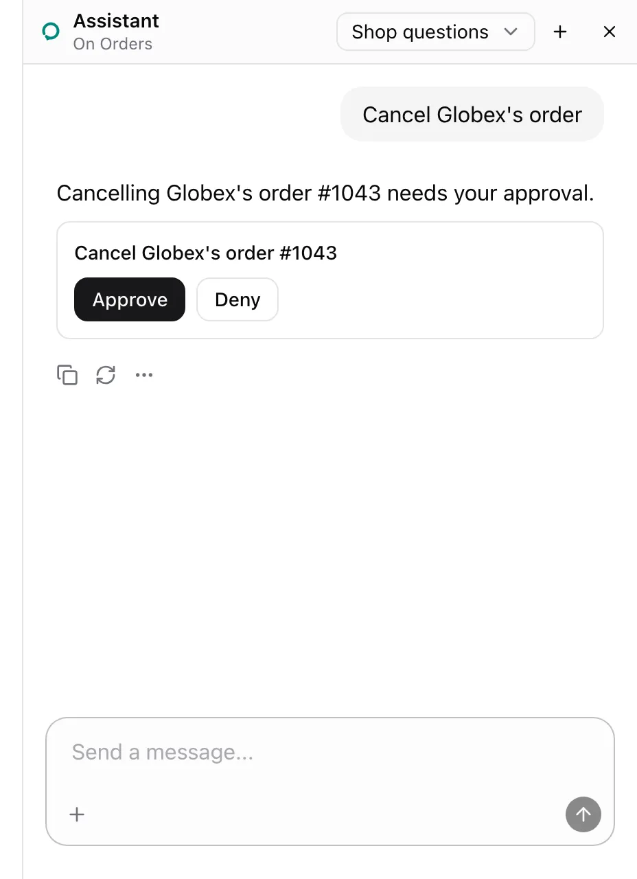
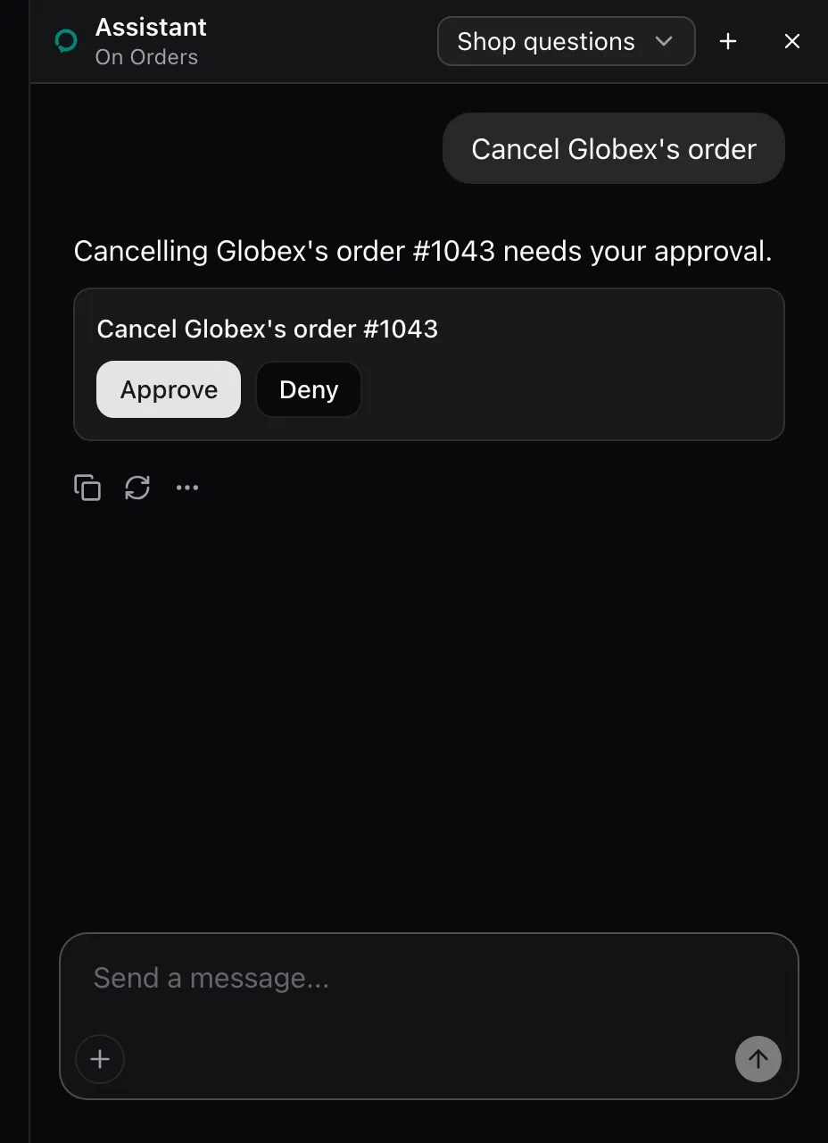
Add the cards’ styles to your global CSS:
npx shadcn@latest add https://super-assist.dogar.biz/r/assisted-cards.jsonThe card shows up for every consequential action or tool. From examples/app/app/orders/page.tsx:
<AssistedAction name="cancel_order" id={order.id} label={`Cancel ${order.customer}'s order #${order.id}`} consequential="confirm"> <Button size="sm" variant="outline" onClick={() => shop.call("cancelOrder", [order.id])} > Cancel </Button></AssistedAction>What the model sees
Section titled “What the model sees”The action’s entry ends with (asks first), so the model calls it and lets the panel ask. While the card waits, the call has no answer. The card shows the picked row’s label, Cancel Globex's order #1043. For a tool it shows the tool’s description.
States
Section titled “States”Approved
Section titled “Approved”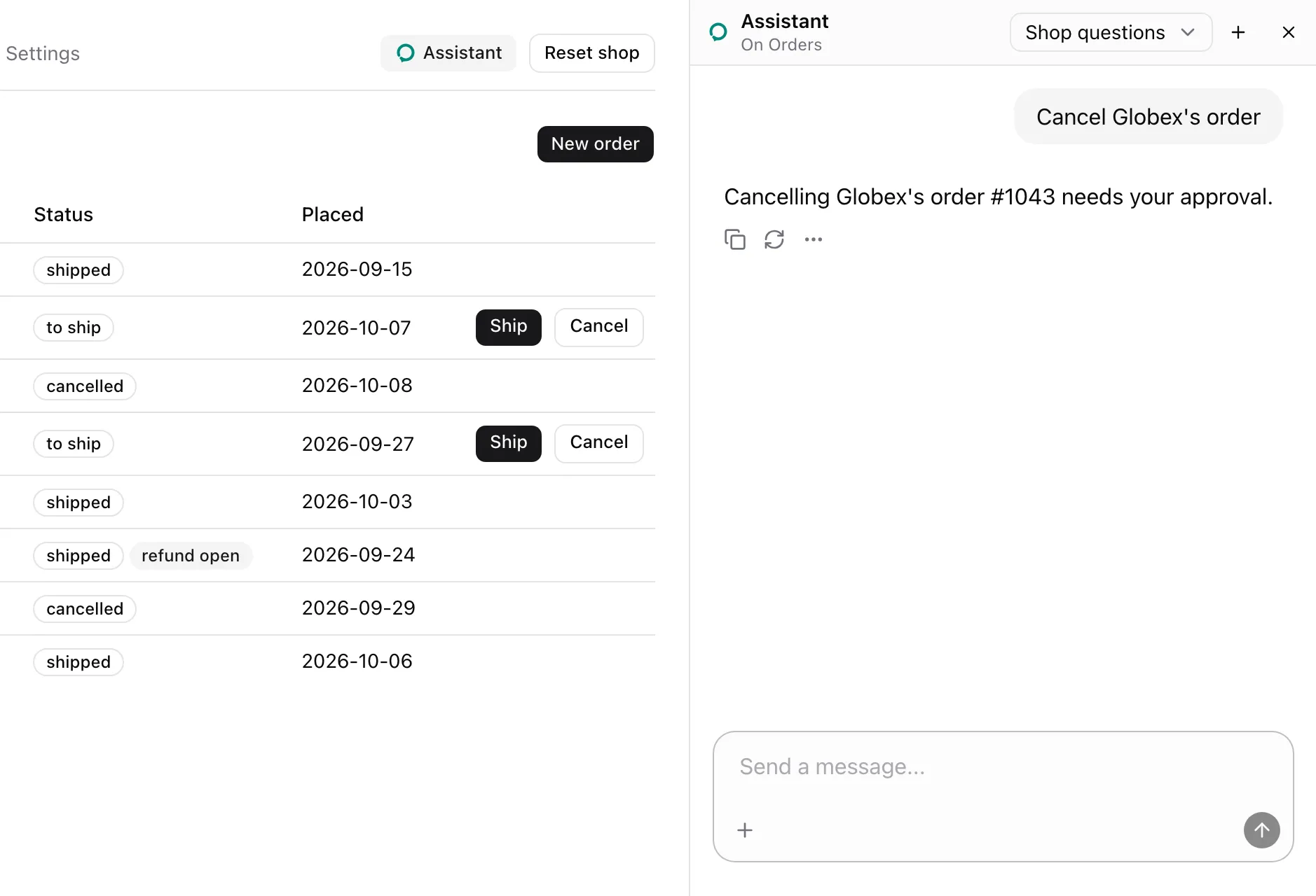
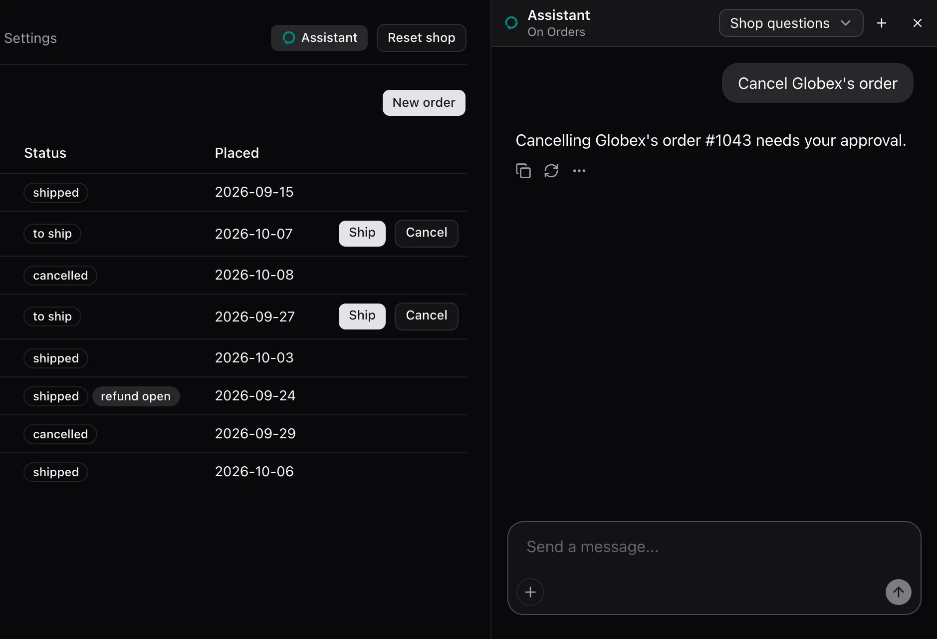
Approve removes the card, checks the element again and presses it. The call answers Approved by the user and pressed "Cancel Globex's order #1043". with the Orders note.
Declined
Section titled “Declined”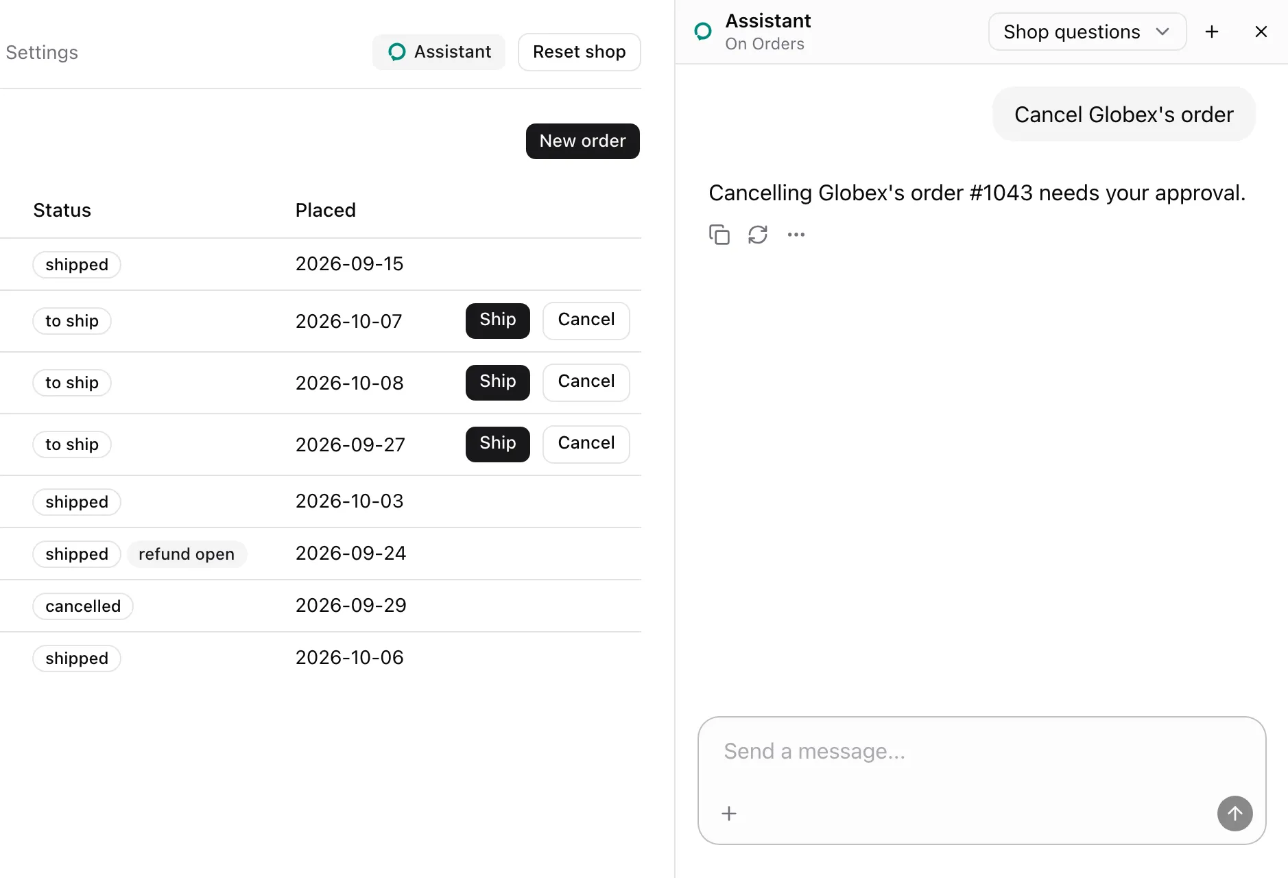
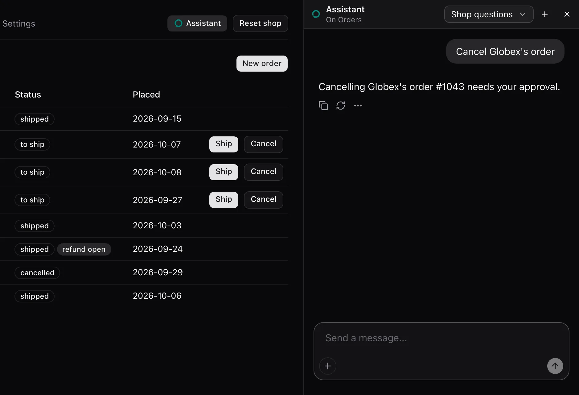
Deny removes the card and nothing is pressed. The call answers The user declined "Cancel Globex's order #1043". That is final: leave it unless they ask for it again.
None. The package registers the card for each consequential action or tool by name and renders it outside assistant-ui’s tool group. A tool’s own render replaces it. Style it through [data-assisted-confirm] and [data-answer]: the registry reference lists the rules and Model context the card’s DOM.