
AssistedAction
AssistedAction lends one element of an assisted page as an action: the assistant presses it, or, when it is consequential, rings it for the user or asks in the panel first. useAssistedAction is the hook behind it, and ring and useRing point at any element.
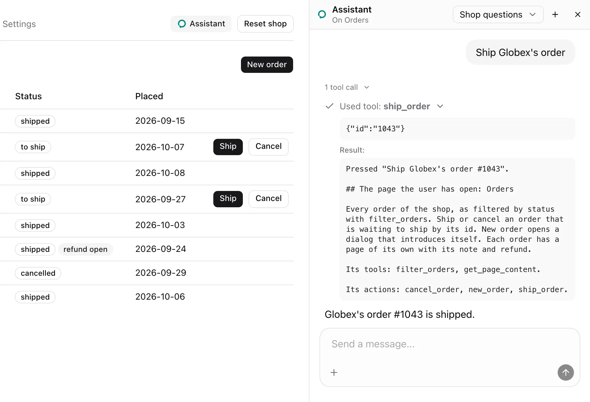
Give each row the same name and its own id. From examples/app/app/orders/page.tsx:
<AssistedAction name="ship_order" id={order.id} label={`Ship ${order.customer}'s order #${order.id}`}> <Button size="sm" onClick={() => shop.call("shipOrder", [order.id])}> Ship </Button></AssistedAction>What the model sees
Section titled “What the model sees”Same-name actions on a page are one tool that picks a row by id. With the shop’s seed data, ship_order is described as:
Press one of these by its id. 1042: Ship Acme's order #1042; 1043: Ship Globex's order #1043; 1044: Ship Umbrella's order #1044It takes { id }, an enum of 1042, 1043 and 1044, and the Orders note lists it under Its actions:. A consequential action carries a marker. cancel_order, with consequential="confirm":
Press one of these by its id. 1042: Cancel Acme's order #1042 (asks first); 1043: Cancel Globex's order #1043 (asks first); 1044: Cancel Umbrella's order #1044 (asks first)refund_order on an order’s page, with consequential:
Refund this order (consequential)The press in the screenshot answered with its label and the page as the press left it:
Pressed "Ship Globex's order #1043".
## The page the user has open: Orders
The Orders note follows in full. Every answer is listed in Model context.
States
Section titled “States”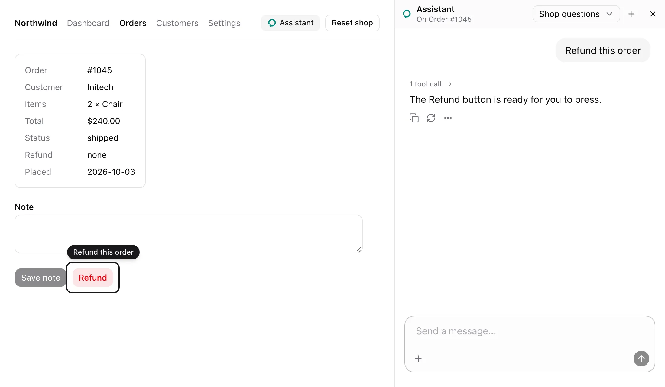
With consequential, a call rings the element and presses nothing. It answers Rang "Refund this order" for the user; pressing it is theirs.
Asking
Section titled “Asking”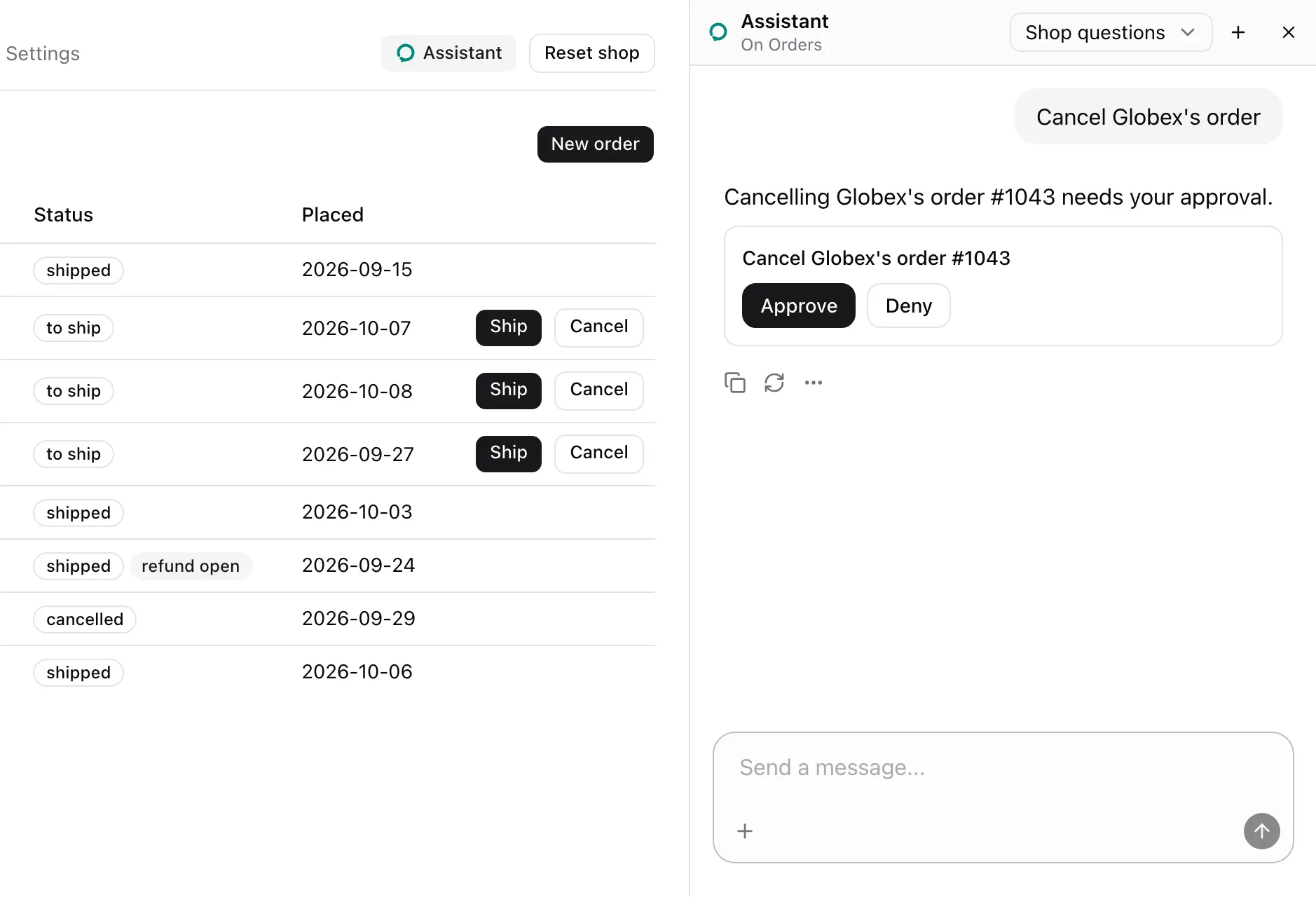
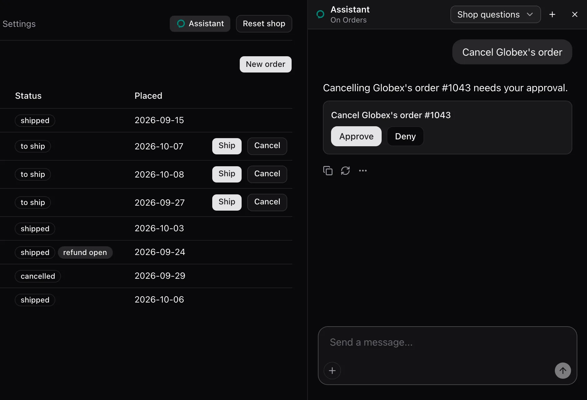
With consequential="confirm", a call asks in the panel with the picked row’s label. The Confirm card shows the question, and nothing is pressed while it waits.
Declined
Section titled “Declined”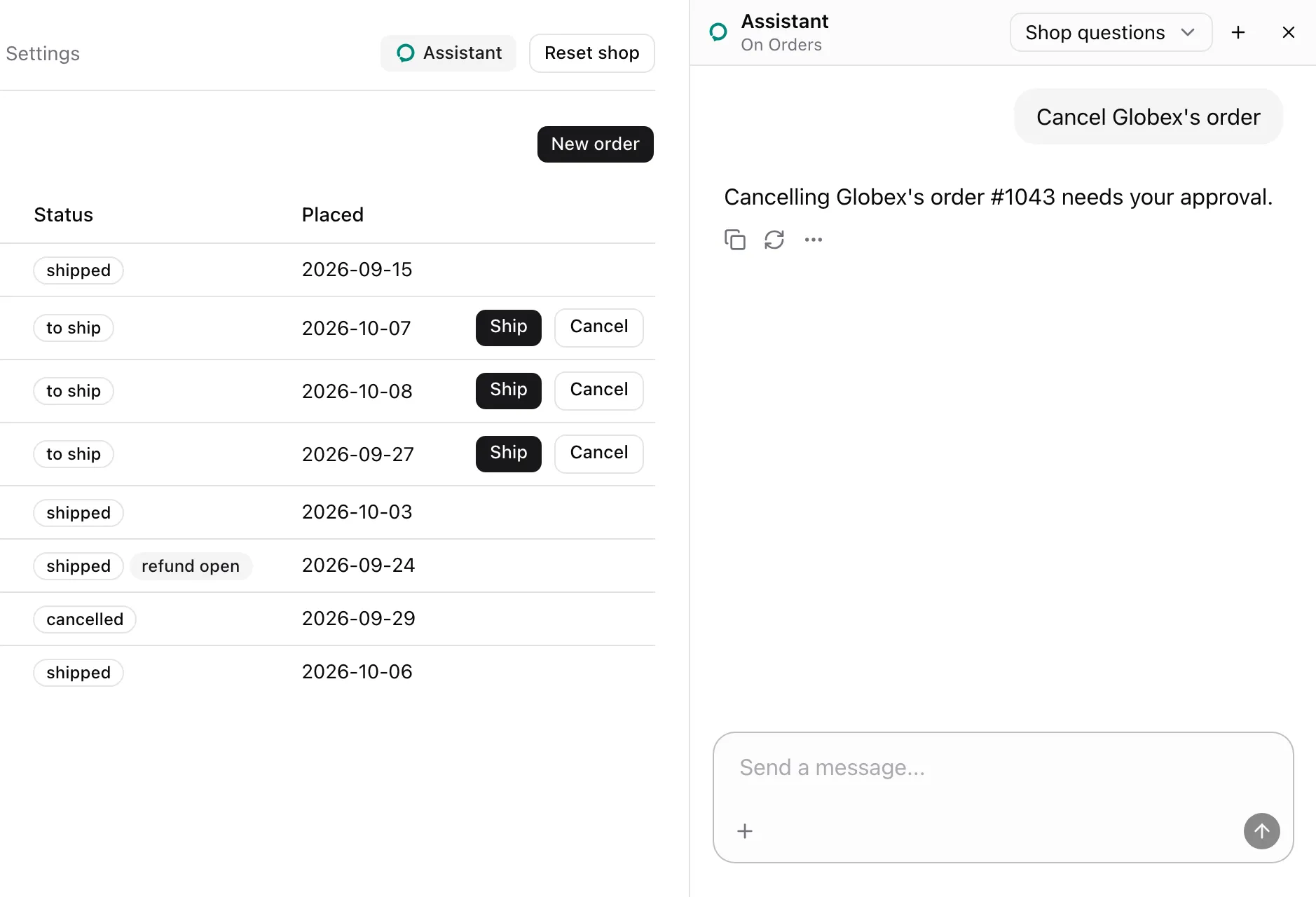
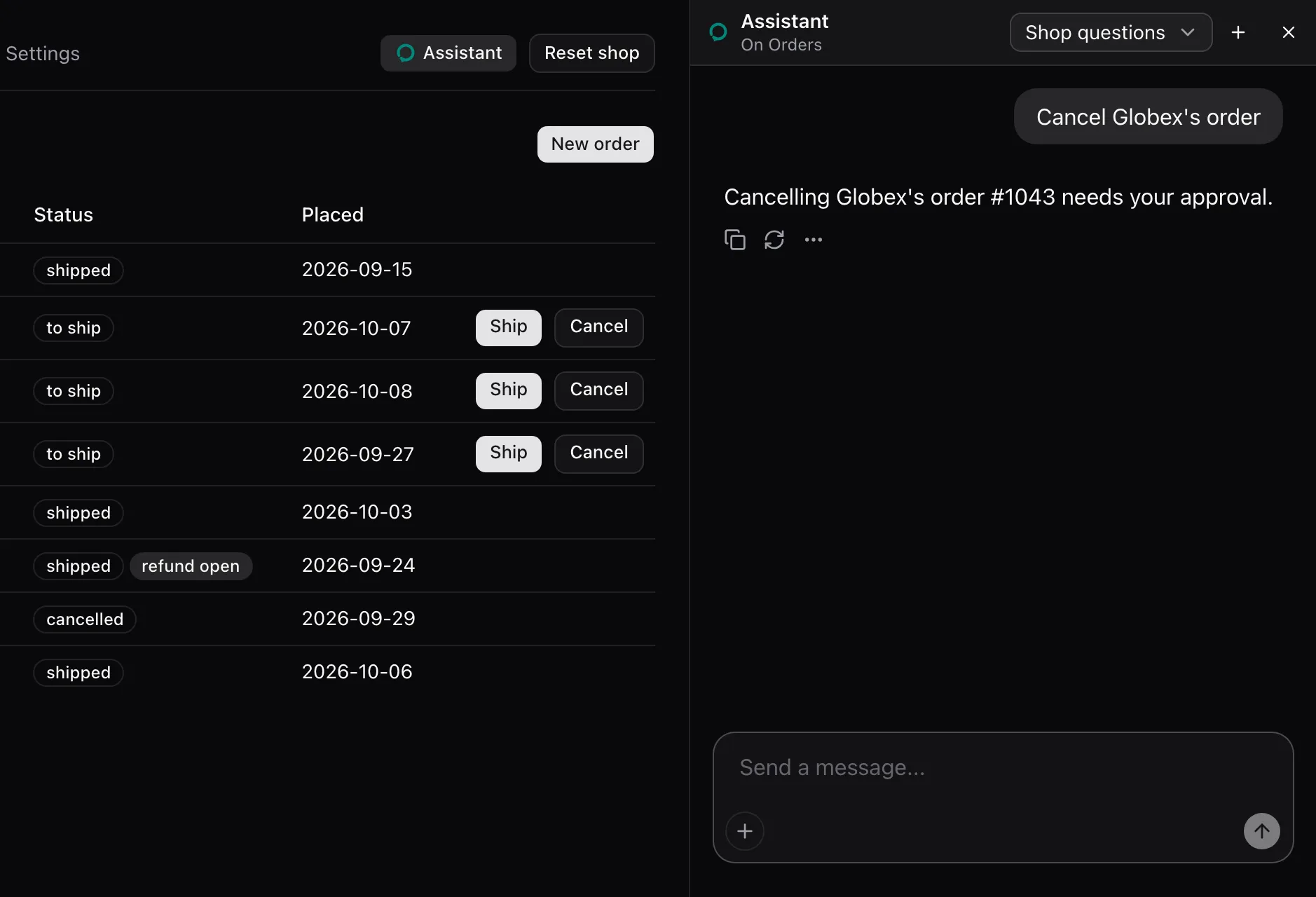
Deny removes the card and presses nothing. The call answers The user declined "Cancel Globex's order #1043". That is final: leave it unless they ask for it again.
Disabled
Section titled “Disabled”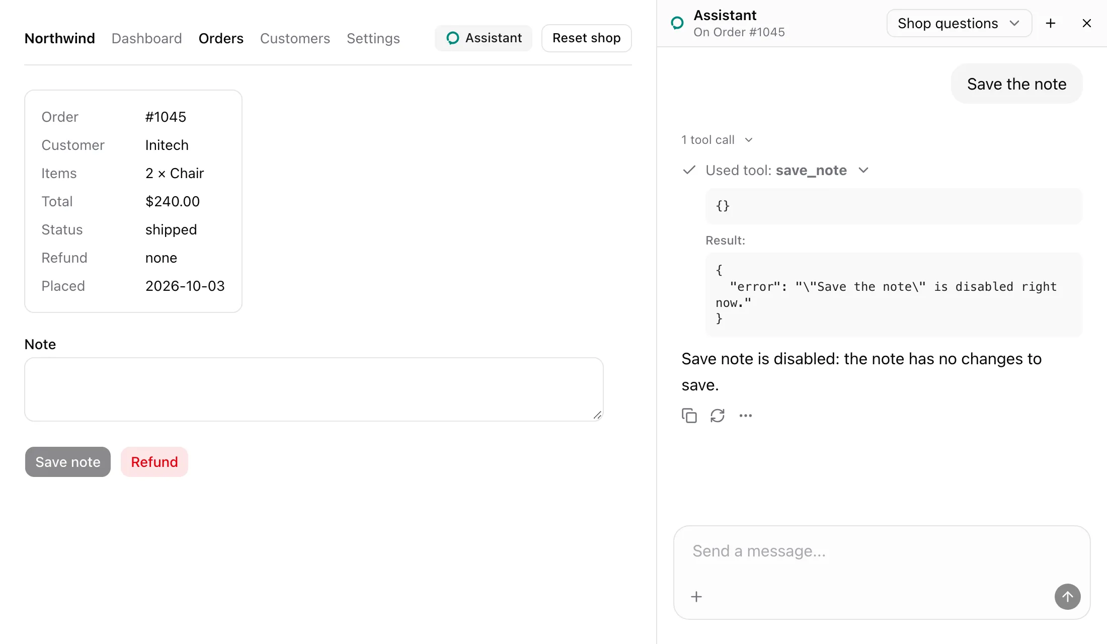
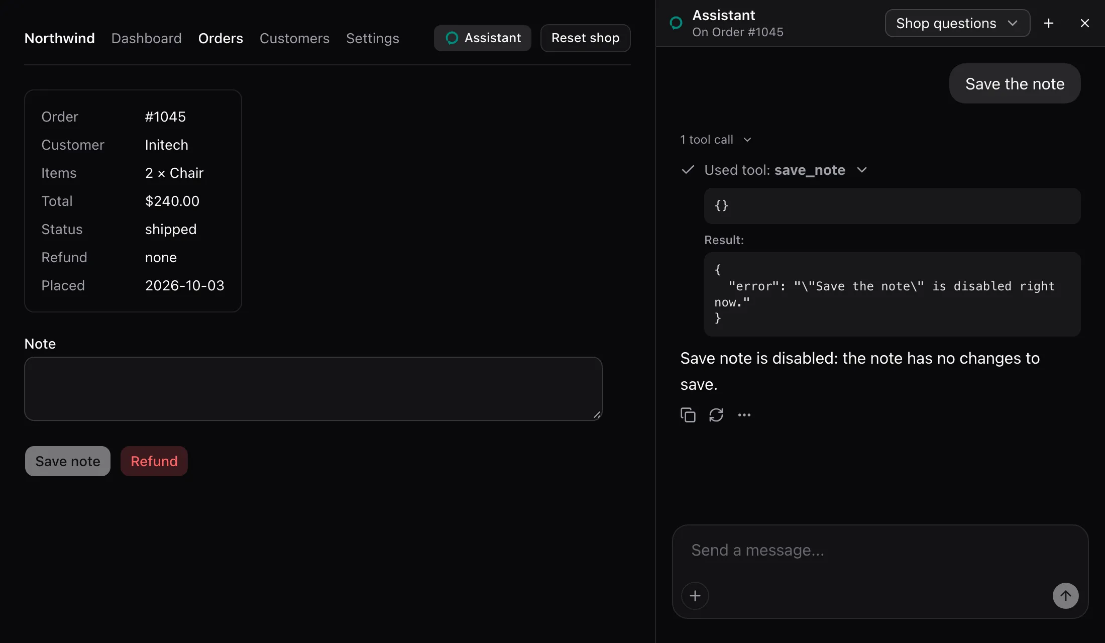
A disabled element is not clicked. The call answers { error: '"Save the note" is disabled right now.' }.
| Prop | Type | Required | Description |
|---|---|---|---|
name |
string |
Yes | The action’s name. Same-name actions on one page are one tool. |
label |
string |
Yes | What pressing does. Becomes the tool’s description, or one entry of it. |
id |
string |
No | The row’s id within a same-name group. |
consequential |
boolean | "confirm" |
No | true rings the element for the user. "confirm" asks in the panel, then presses. |
children |
ReactElement |
Yes | One element whose ref reaches a DOM element. Its own ref is kept. |
- Throws
Render an assisted action inside an AssistedPageoutside a page. - Without ids, the tool’s description is the label with its marker, and it takes no parameters.
- With ids, the tool takes
{ id }with an enum of the mounted rows’ ids. Its description readsPress one of these by its id.followed by<id>: <label>pairs. - A press waits for pending React updates to commit, then checks the element. Missing or disabled, it answers with an error and clicks nothing.
consequentialrings the element and answers that pressing is the user’s.consequential="confirm"asks in the panel, checks the element again on approval, then clicks and answersApproved by the user and pressed "<label>".with the page’s note. A denial answers with the decline text.- A click answers
Pressed "<label>".with the note of the page as the press left it, after the page changes or 300 ms.
useAssistedAction
Section titled “useAssistedAction”useAssistedAction<T extends HTMLElement = HTMLElement>(options: AssistedActionOptions): RefObject<T | null>The hook behind AssistedAction. AssistedActionOptions is { name, label, id?, consequential? }, as in the table above. Attach the returned ref to the element to press. Throws outside an AssistedPage.
ring(target: HTMLElement, options?: RingOptions): () => voidPoints at one element, as in the Rung state. Returns a function that dismisses the ring.
RingOptions field |
Type | Default | Description |
|---|---|---|---|
message |
string |
"The assistant points here" |
The word from the assistant beside the ring. |
- One ring at a time. A new ring dismisses the open one.
- Scrolls the target to the center of the view, smoothly unless the user prefers reduced motion.
- Draws an outline 8 px outside the target that follows it as it moves, and pulses twice. Under reduced motion it fades once.
- Shows the message above the target, or below when there is no room. The message has
role="status". - Dismissed by Escape, by any pointer down, by the target leaving the document, or by the returned function.
- Sits at z-index 40. Colors come from
--primaryand--primary-foreground, with#2563eband#fffas fallbacks.
useRing
Section titled “useRing”useRing(): (target: HTMLElement, options?: RingOptions) => () => voidring for a component. Dismisses the ring it opened when the component unmounts.