
Choices card
The choices card shows the question an offer_choices call asks, with two to four answers the user picks with one click. The pick is the call’s answer.
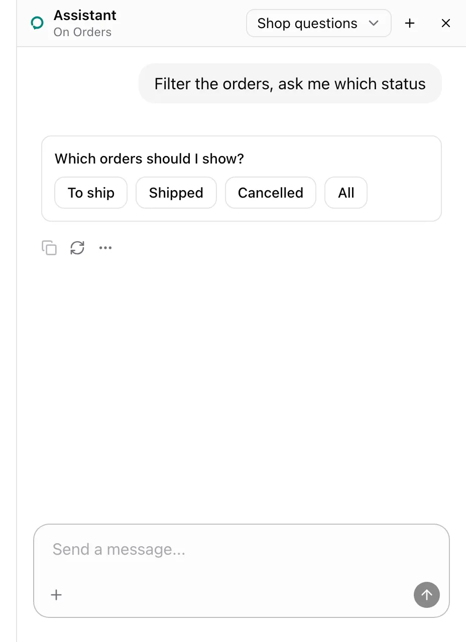
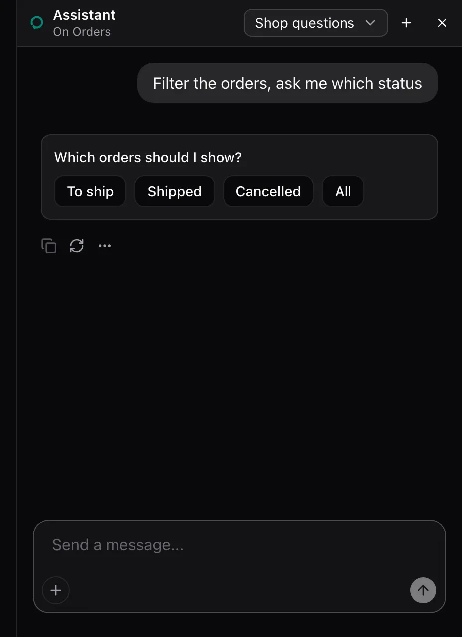
AssistedProvider lends offer_choices on every page. Add the cards’ styles to your global CSS:
npx shadcn@latest add https://super-assist.dogar.biz/r/assisted-cards.jsonWhat the model sees
Section titled “What the model sees”offer_choices is described as:
Ask the user a question with two to four short answers they pick with one click, and answer with their pick.It takes question, a string, and options, two to four strings. The call waits for the pick.
States
Section titled “States”Picked
Section titled “Picked”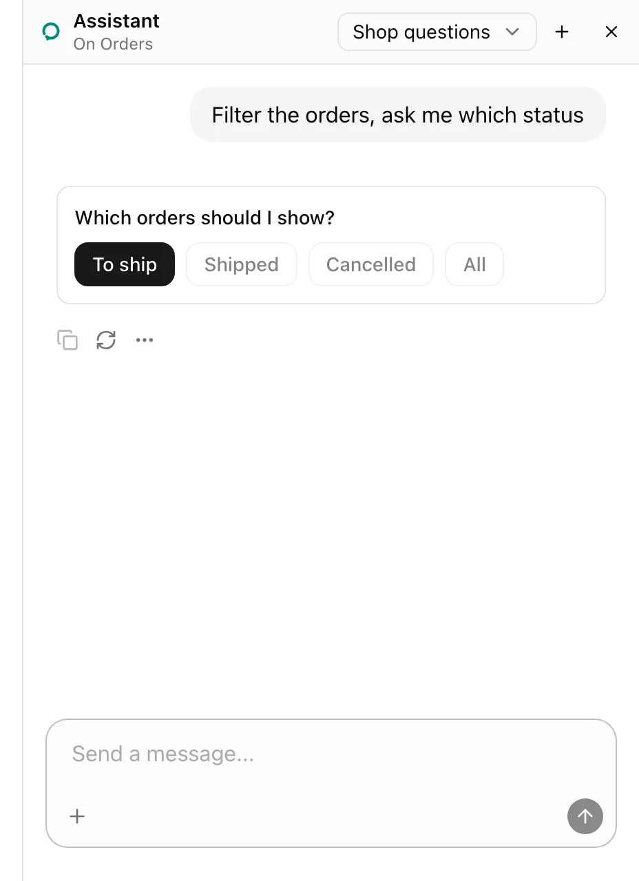
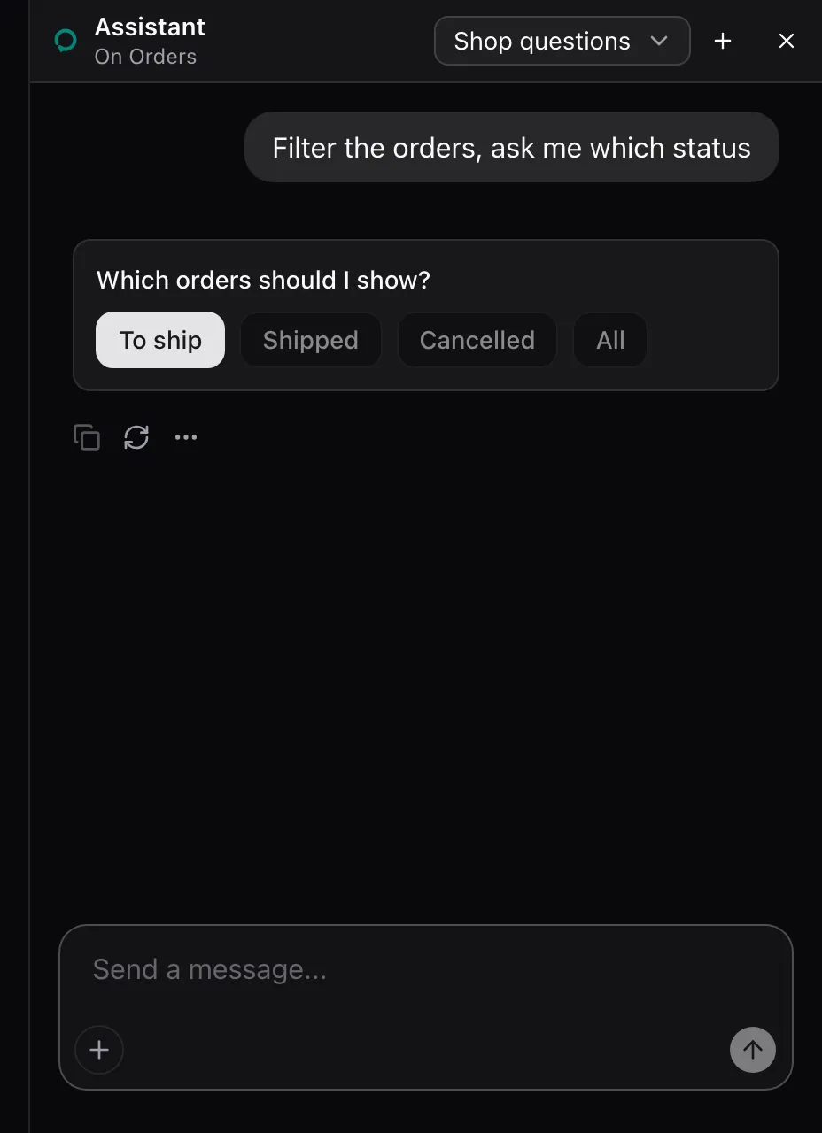
The pick answers the call with The user picked "To ship". The card stays in the thread with the pick filled and its buttons disabled.
None. The package renders the card in place of the offer_choices call. Style it through [data-assisted-choices] and [data-picked]: the registry reference lists the rules and Model context the card’s DOM.
See also
Section titled “See also”- Model context lists every built-in tool.