
AssistedInput
AssistedInput lends one form field of an assisted page as a field the assistant fills as the user would type into it, and shows what it says now in the page’s note. useAssistedInput is the hook behind it.
Wrap the field. From examples/app/app/orders/[id]/page.tsx:
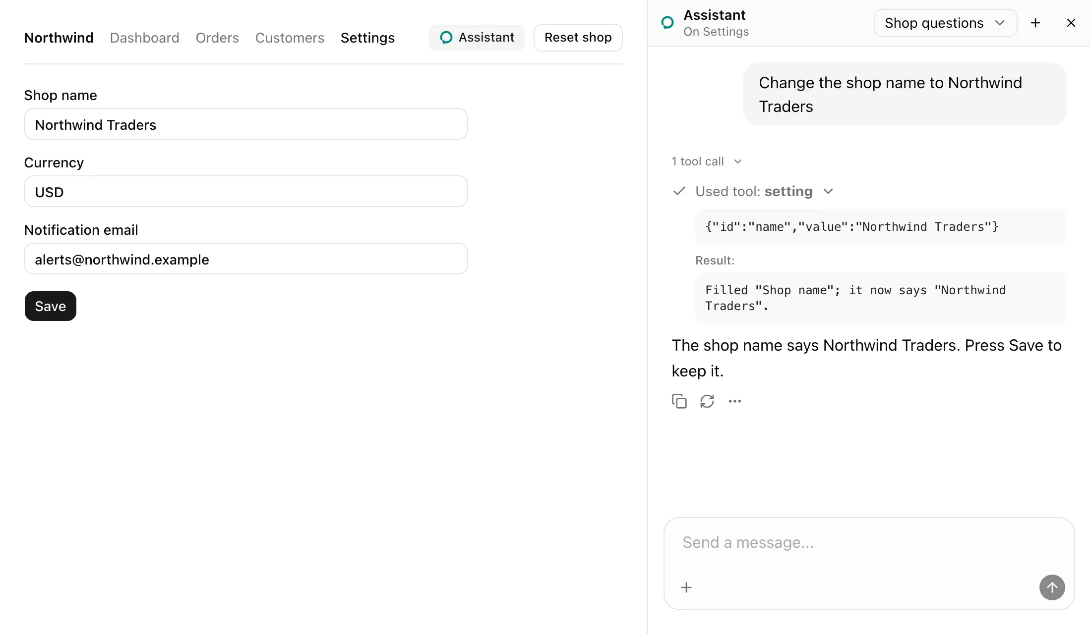
<AssistedInput name="note" label="The order's note"> <Textarea value={draft} onChange={(event) => setDraft(event.target.value)} /></AssistedInput>The Settings form in the screenshot gives its three inputs the name setting and an id each, in examples/app/app/settings/page.tsx.
What the model sees
Section titled “What the model sees”Same-name fields on a page are one tool that fills a field by id. Settings’ setting is described as:
Fill one of these by its id. name: Shop name; currency: Currency; email: Notification email.It takes { id, value }. The page’s note shows what each field says now:
Its fields: setting (name: Shop name, now "Northwind"; currency: Currency, now "USD"; email: Notification email, now "alerts@northwind.example").The fill in the screenshot answered without the note:
Filled "Shop name"; it now says "Northwind Traders".A fill changes the form, not the shop. Saving is the page’s Save action, here a consequential one the user presses.
States
Section titled “States”Filled by id in a dialog
Section titled “Filled by id in a dialog”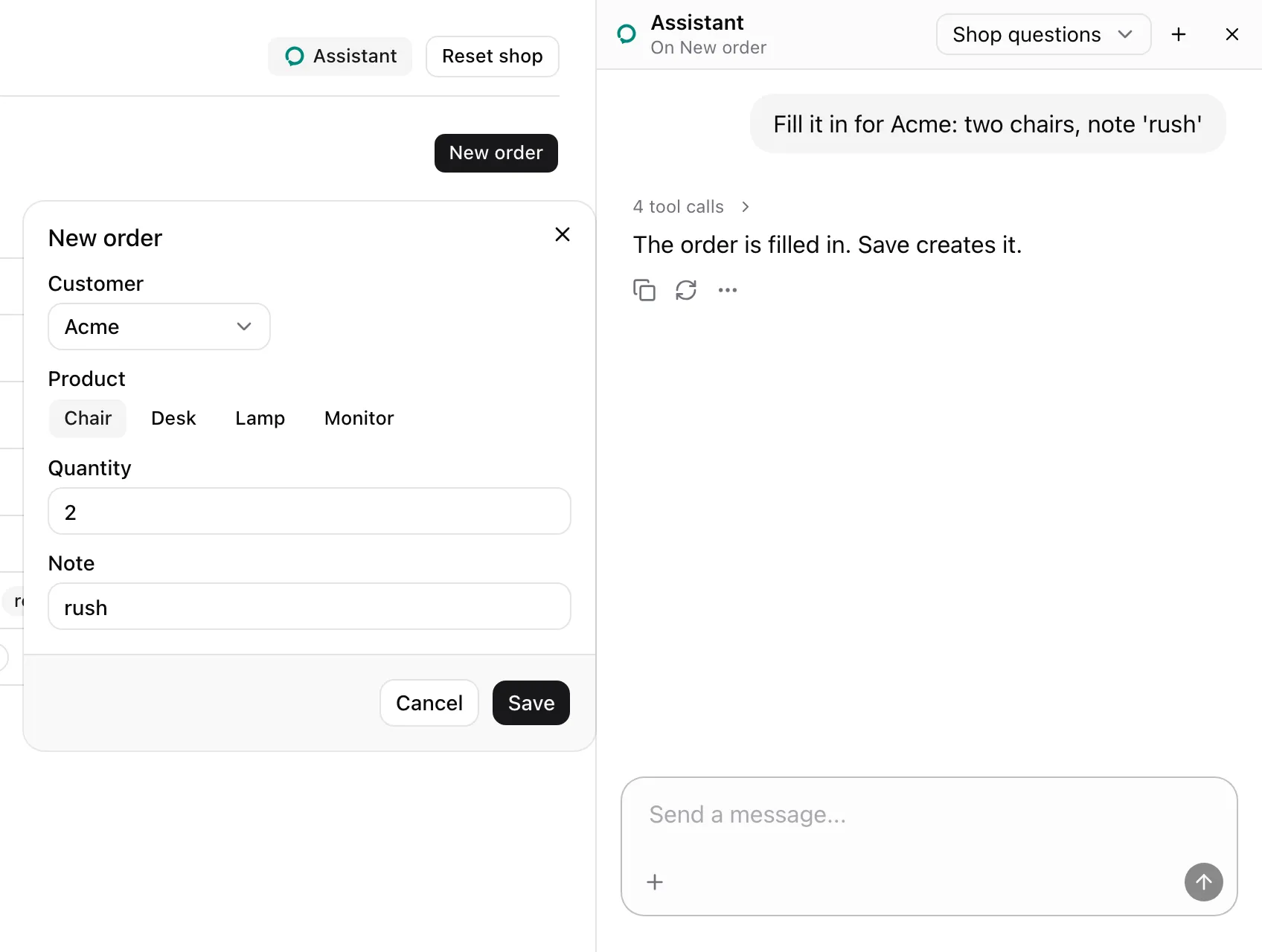
The New order dialog lends its customer select and its quantity and note inputs as order_field, beside a product picker lent through AssistedField. A select’s options become the values its field takes, so the customer’s entry reads customer: Customer, one of "" (Pick a customer), "Acme", "Globex", "Initech", "Umbrella". Four calls in one step filled the form, and Save creates the order.
| Prop | Type | Required | Description |
|---|---|---|---|
name |
string |
Yes | The field’s tool name. Same-name fields on one page are one tool. |
label |
string |
Yes | What the field holds. Shown in the tool’s description and the page’s note. |
id |
string |
No | The field’s id within a same-name group. |
consequential |
boolean |
No | true rings the field for the user to fill. |
children |
ReactElement |
Yes | One element whose ref reaches the field’s DOM element. Its own ref is kept. |
- Throws
Render an assisted field inside an AssistedPageoutside a page. - Reads the element’s kind when it mounts, and a select’s options then.
- Fills by the element’s kind:
| Element | Fill | Options | Value in the note |
|---|---|---|---|
input, textarea |
The element’s own value setter, then an input event |
None | The value as a JSON string |
input type="password" |
As above | None | (filled) or (empty) |
Checkbox, role="switch" |
A click when its state is not the asked on or off |
on, off |
on or off |
select |
The element’s own value setter, then a change event |
Its options |
The value as a JSON string |
| Anything else | None. Rings it | None | Its trimmed text as a JSON string |
- Text values longer than 200 characters are cut and end with
…. - A fill checks the element first. Missing, disabled (
:disabledoraria-disabled="true") or read-only (readonlyoraria-readonly="true"), it answers with an error and fills nothing. consequential, or an element of no known kind, rings the element and answers that filling is the user’s. Its label gains(consequential).- A fill waits for pending React updates to commit, then answers
Filled "<label>"; it now says <value>. - Exact answers are in Model context.
useAssistedInput
Section titled “useAssistedInput”useAssistedInput<T extends HTMLElement = HTMLElement>(options: AssistedInputOptions): RefObject<T | null>The hook behind AssistedInput. AssistedInputOptions is { name, label, id?, consequential? }, as in the table above. Attach the returned ref to the field. Throws outside an AssistedPage.
See also
Section titled “See also”- Lend a form’s fields.
- AssistedField for a control that keeps its value in state.
- How model context composes.